Trading education PLATFORM
London Trading Institute
Timeline
The project spanned 4 weeks as a freelance assignment, involving research, design, prototyping, feedback iterations, and final hand-off.
Background
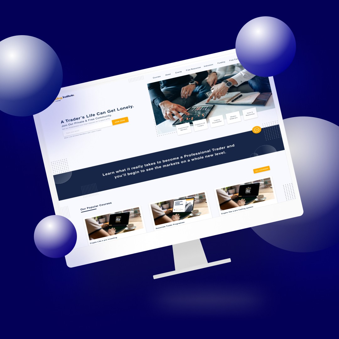
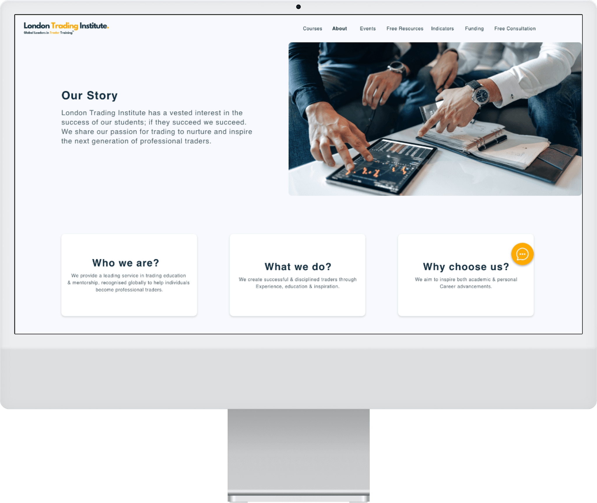
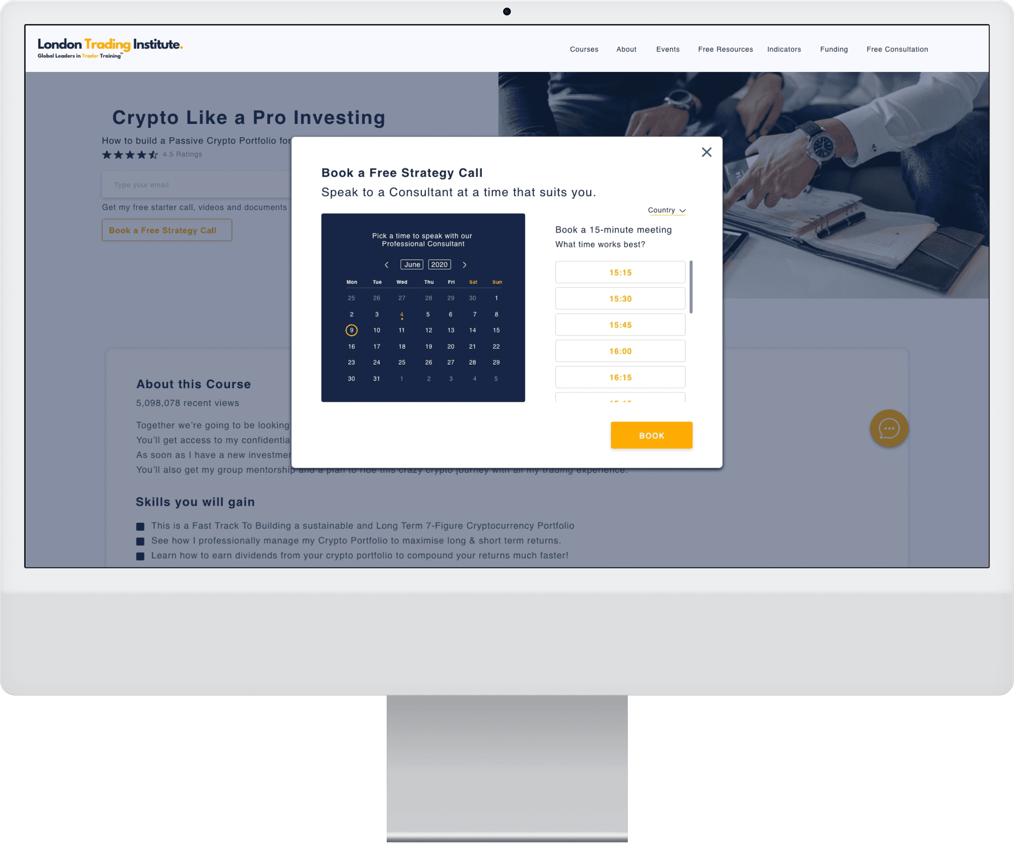
London Trading Institute (LTI) offers a variety of trading programs aimed at different skill levels, from beginners to advanced traders. The previous website had a confusing navigation structure, repetitive information, and lacked simplicity. Our goal was to streamline the user journey, making the course selection process intuitive and reducing friction for users at all levels.
Research & Planning
We conducted stakeholder interviews and calls to understand the user segments, including newbies, trading students, and experienced traders.
Personas were developed for each group, identifying their key tasks and pain points.
Newbies struggle with lack of knowledge, confidence, and overwhelming emotions. Their primary tasks involve learning basic trading strategies, risk management, and taking assessments.
Trading students are more confident but still seek guidance in intermediate and professional courses.
Experienced traders focus on making more money, building like-minded communities, and accessing advanced tools. Their pain points include overconfidence and emotional management.
We analyzed the current site map and identified issues such as confusing navigation, cluttered layouts, and lack of design simplicity. Competitor analysis helped inform our approach to categorizing programs and improving the user flow.
Design & Prototyping
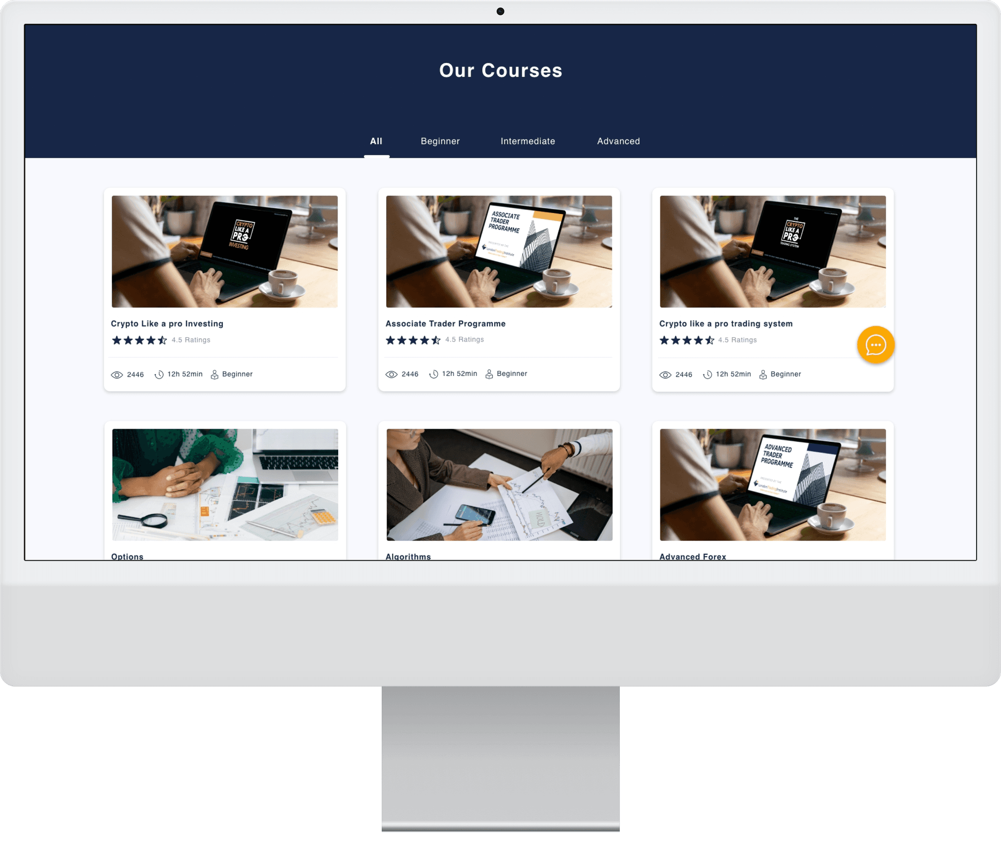
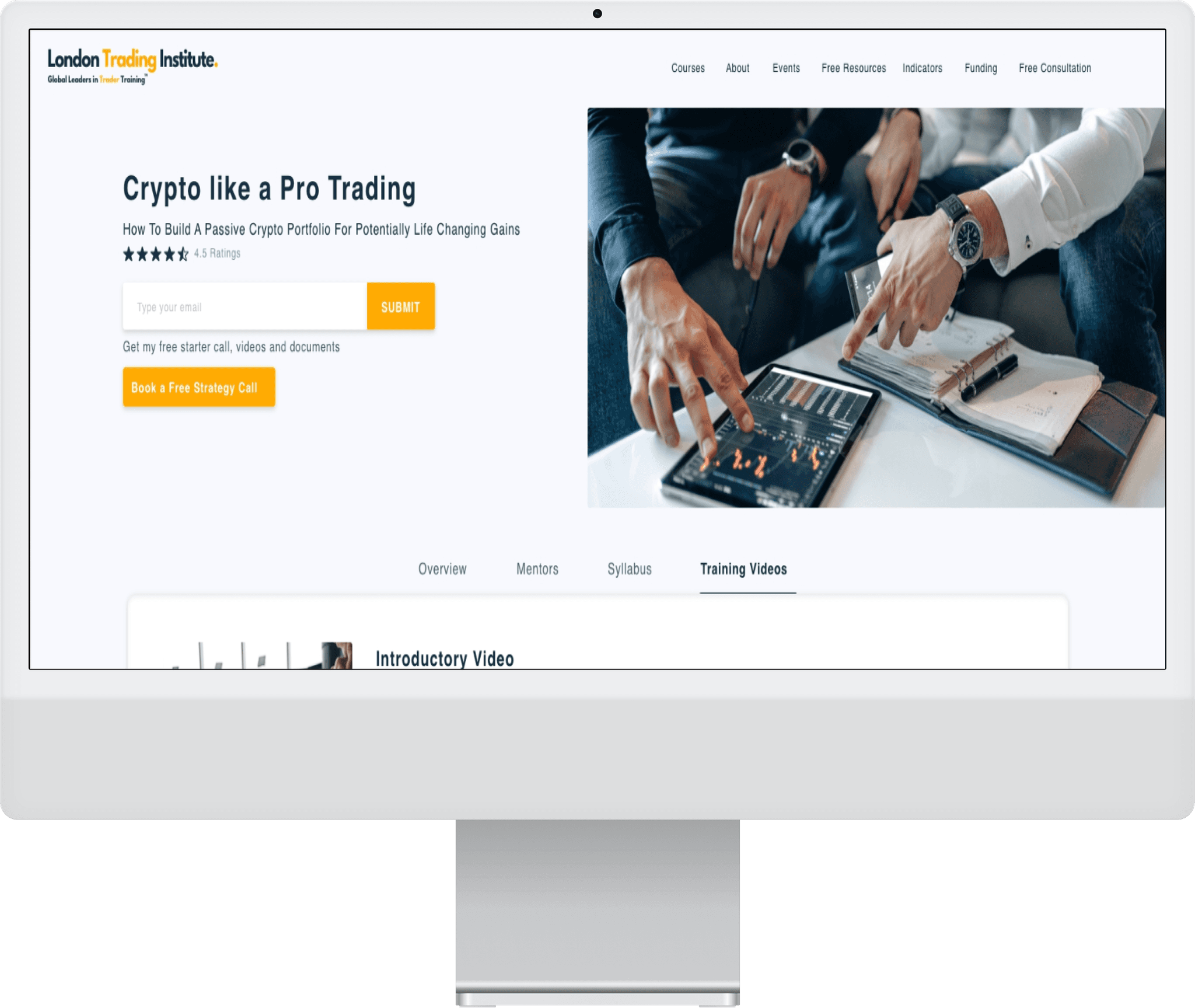
We created a clean, user-friendly design with streamlined navigation, ensuring users could access programs with just a few clicks.
Key programs included:
1. Crypto Like a Pro (beginner course)
2. Associate Trader Program (beginner to intermediate)
3. Crypto Like a Pro Investing (intermediate to advanced)
Wireframes and prototypes were developed and iterated based on client feedback, ensuring alignment with the brand’s color scheme and visual identity.
Implementation
Throughout the process, we iteratively improved the design based on feedback from the stakeholder. We focused on delivering screens on time, making real-time changes to accommodate the client’s requests, and ensuring the final design was intuitive and easy to navigate.
Testing & Optimization
We continually tested the wireframes and prototypes, gathering feedback to refine the design. The final website ensured users could easily navigate through programs without confusion or
unnecessary clicks.
Streamlined Navigation
Users could access programs without searching through cluttered menus.
Clear Program Information
All courses were displayed in a clear, concise format, reducing confusion.
Improved User Journey
he design addressed the specific needs of different trading personas, from newbies to
experienced traders.
Enhanced Usability
Users reported that the simplified navigation and program information made it easier to find the
right courses.
Improved User Experience
Newbies found the site less overwhelming, while experienced traders appreciated the quick access to advanced tools and programs.
Client Satisfaction
The client was pleased with the clean design and timely delivery of the project, meeting their expectations for a more streamlined online presence.